2semesters 150entradas 150posts 2semestres
425 Park Avenue . New York
OMA . + archdaily
For commercial buildings, Manhattan’s zoning laws prescribe a silhouette from which there is no escape (yet): a stretched pyramid.
Our current aesthetics oscillate between nearly exhausted orthogonality and a still immature curvaceousness.
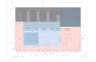
Our building is an intersection of these two observations: it proposes a stack of three cubes—the lower one a full solid block on Park Avenue, the smallest on top, rotated 45 degrees vis a vis the Manhattan grid, oriented beyond its mere location in a sweep from midtown to Central Park.
The three cubes are connected by curved planes to create a subtle alternation of flat and three dimensional planes, each reflecting sky and city in their own way.
The shape is at the same time highly artistic and highly efficient, a diagram of maximum beauty and maximum rentability, combined in a single, Brancusi-like shape. Its geometry at the same time reinforces and escapes the existing city. It resonates with each of its famous neighbors—Seagram, Lever, AT&T, Racquet Club—yet is emphatically futuristic.
Its conceptual model accommodates both the design competition’s request to maintain 25% of the existing building and the entirely-from-scratch scenario with equal ease.
Partners-in-Charge: Shohei Shigematsu, Rem Koolhaas
Associate-in-Charge: Jason Long
Project Architect: Jake Forster
Team: Ted Lin, Sandy Yum, Ahmadreza Schricker, Patrick Hobgood, Daniel Quesada Lombo, Andy Westner, Rob Daurio, Clarisa Garcia Fresco, Carla Hani, Suzan Ibrahim, Christina Argyrou, Cass Nakashima, Lisa Hollywood, Denis Bondar
Structure, MEP / Services, Facade: ARUP
Vertical Transportation: Edgett Williams Consulting Group Cost Estimating: Faithful & Gould
Models: OMA/ Vincent de Rijk
Graphic Design: MTWTF


.jpg)


.jpg)
.jpg)
.jpg)

.jpg)
.jpg)
.jpg)

.jpg)
.jpg)


0 comentarios :
Publicar un comentario